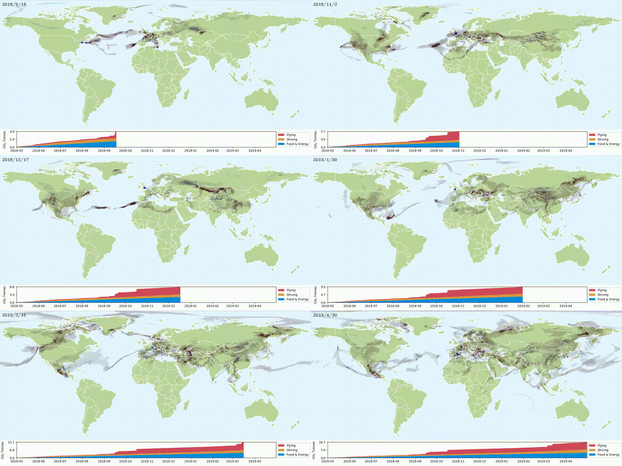
My CO2 Emissions

I was asked an interesting question, “how long does it take for our breath to travel around the world? While I don’t think I was able to answer that question, it lead me down the path of visualizing the winds, tracking carbon emissions, and ultimately creating this art piece to tell the story of my past years travel.
Methodology
I have taken the data from two sources
My Google location history, from tracking the location of my phone
ERA5 wind data, taking the 10m high wind data from the past year.
Then I used Python to simulate where my emissions would end up given the historical wind data, and then visualise it with a combination of matplotlib, and some custom image processing code.
There’s a few bad assumptions made here, so it’s not an accurate depiction of the spread of CO2, but I think regardless it makes for a thought-provoking visual.
It’s using wind data from 10m above the ground, but it doesn’t really take into the air trapped inside or blocked by buildings, or that the air rises into the higher atmosphere where it has faster wind speeds.
The airplane polution is blown around using the highest altitude wind data ERA5 could give me, which is 100m, and that’s obviously way too low, I just couldn’t find a source for high altitude winds.
The amount of my CO2 emissions is an estimate, with food and energy resources being based on the average UK citizen using 5T of CO2 per year for it, with a diesel van emitting 132g per Km, and with planes using 158g per Km.
